Build a Website with Claude Code Without the Generic AI Look
Claude Code builds a working one-page site in under a minute, but from a bare prompt you get the template look: gradient hero, a row of identical cards. Worse, it fills gaps with invented facts. Asked to decide the design first, in a short design.md, the same tool produced a page that fits the business, and it refused to fake prices. Below are both results, the three prompts, and the checks we run before anyone sees a page.
Tested by us on 11 November 2026.
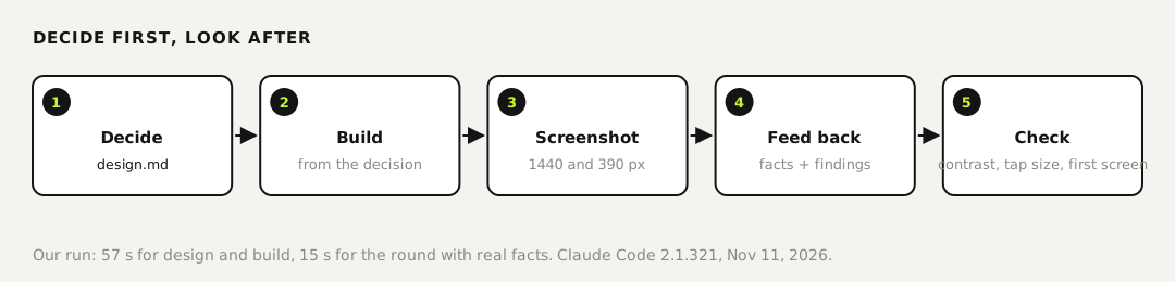
What it does
In goes a business, its facts and a design decision; out comes a single index.html you can host anywhere. You need Claude Code on a paid plan, a browser to look at the result, and ten minutes. Our design and build rounds cost $0.22 in tokens according to Claude Code's own count, and the round with real facts $0.19.
The test: one shop, two ways of asking
We made up a shop, Riverside Bike Repair in Portland, so nothing on the page could be real by accident. Version A got one sentence: build a one-page website for this shop, single HTML file, no frameworks. Version B got three prompts: decide the design first, build from it, then real facts plus what we saw in the screenshots. Both ran on Claude Code 2.1.321.
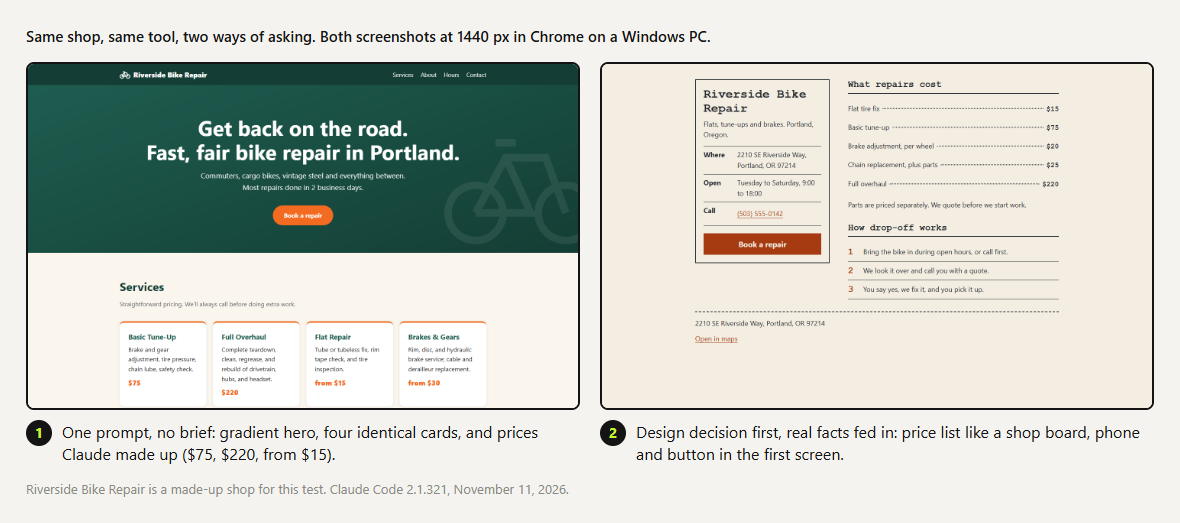 (opens at full size)
Version A took 26 seconds and looked like a thousand other sites. It also had prices: a tune-up for $75, an overhaul for $220, flats from $15. We never gave it prices. Claude invented them, plausibly, and a shop owner skimming the page could easily miss that. Version B's first build said $TODO wherever a fact was missing, because its design note said placeholders must be marked and never faked.
Step 1: decide the design before any code
Before any code, write design.md for a one-page website for Riverside Bike Repair, a small bike repair shop in Portland. Decide: who visits and what they need in ten seconds; the one action we want (one primary button); a layout idea that fits a workshop, not a generic startup page; two system font stacks (no web fonts); three colors with their contrast ratios against the background, all at least 4.5:1 for text; and a list of things we will NOT do: no gradient hero, no row of three identical feature cards, no stock photos, no lorem ipsum. Keep it under 40 lines. Do not write any HTML yet.Prompt 1, word for word. Swap in your own business; keep the list of things you won't do.
Claude wrote 38 lines: the visitor is a rider with a broken bike, probably on a phone; the one action is "Book a repair"; the layout is a shop tag beside a price list with dotted leaders, like a chalkboard. It chose three colors and computed their contrast. We recomputed them: 12.94:1 for the ink and 5.57:1 for the rust accent, both above the 4.5:1 minimum for text.
Step 2: build from the decision
Now build index.html exactly according to design.md. Single file, no frameworks, no external images or fonts. Buttons and links at least 44 px tall. Check your own color contrast against design.md before you finish.Prompts 1 and 2 together took 57 seconds. Claude said plainly that it hadn't opened the page in a browser. That's the next step, and it's yours.
Step 3: look at it at 1440 and 390 pixels
We render every page at 1440 pixels, a laptop, and 390, a phone, and look at the first screen of each. On the phone, version A's hero filled most of the screen before any useful information. Version B put the address, hours, phone number and the button in the first screen.
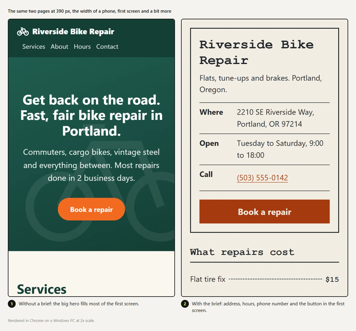 (opens at full size)
Step 4: feed back facts and what you saw
Here are the real facts: address …, opening hours …, phone …, prices: flat tire fix $15, basic tune-up $75 … Fill these in everywhere a TODO is. From our screenshots: at 1440 px the heading 'Price board' means nothing to a customer, so rename it. Keep everything else as design.md says.Prompt 3, shortened here; we gave the full address, hours and five prices.
Fifteen seconds later every placeholder was filled, the phone link and the button both dialed the shop, and the heading read "What repairs cost". Claude changed nothing else, as asked. One round of concrete findings beats asking the agent to "make it better".
Step 5: check before anyone sees it
Our full screen check has twelve points; these five catch most of what goes wrong on a small site:
- One primary action per page, visible in the first screen on a phone.
- Text contrast at least 4.5:1, grey helper text included. Compute it; don't trust the agent's claim.
- Tap targets at least 44 pixels for buttons and links.
- No invented facts: every price, hour and claim comes from you. Search the page for numbers you didn't give.
- Screenshots at 1440 and 390 pixels after every change, looked at by a person.
Where a human signs off
Facts and going live. An agent can draft, build and check contrast, but it can't know your prices or opening hours, and version A shows it will guess when you don't say. Read the page as a customer before it goes online.
When it goes wrong
- It looks generic: the design decision was too vague. Name the things you won't do, in so many words.
- Facts look invented: add "placeholders must be marked TODO, never faked" to the design note and give the facts in a separate prompt.
- It looks fine on a laptop, cramped on a phone: you skipped the 390-pixel screenshot. Check the first phone screen before anything else.
Questions
Can Claude Code build a whole website?
Yes, a simple site takes it under a minute. Whether it's any good depends on the brief: in our test, the same tool produced a generic page from one sentence and a fitting one from a short design decision.
How do I stop Claude Code from making generic designs?
Ask for a design decision first, with the visitor, the one action, a layout idea that fits the business, and a list of things you won't do. Build from that file.
Does Claude Code check its own design?
Only partly. It reported contrast ratios we could confirm, but it said itself that it never opened the page. Look at the screenshots yourself.
What does it cost?
In our test about $0.41 in tokens for all three prompts, according to Claude Code's count. On a subscription it comes out of your plan's usage.
Sources
- W3C: Understanding Contrast (Minimum), WCAG 2.2 checked on
- Claude Code docs: Common workflows checked on
- Claude Code docs: Permission modes (plan mode) checked on
More in claude in practice
- Claude Code Tutorial: Plan, Build, Review and Commit One Real ProjectA Claude Code tutorial built on one real project: plan, build, review and commit, with every prompt word for word and what we had to check ourselves.
- Claude Code Skills: How to Build, Install and Test a SkillBuild a Claude Code skill with a bundled script in ten minutes. We tested when it loads, when it doesn't, and what an unused skill costs in context.
- Installing Claude Code: Pick the Right Version, Install It, Run a First TaskInstall Claude Code with one command, tested on a fresh Mac, Ubuntu and Windows 10: which version to pick, the PATH fix, real errors and a first task.
- Claude Code Agent Teams: Setup, a Real Test, and When They're Worth ItHow to turn on Claude Code agent teams and what a three-teammate review gave us: 24 findings versus 12 from one session, at seven times the cost.
Also useful
- AGENTS.md Explained: One Instruction File for Codex, Claude Code and Other AgentsAGENTS.md is the shared instruction file for coding agents. How Codex reads it, when Claude Code does, and the one-line fix we tested.
- How to Build an MCP Server: A Tested Python and Node ExampleBuild a working MCP server in Python or Node, test it without a model, inspect it, then connect it to an AI app. Full code and the errors we hit.
- Building n8n workflows with Claude Code: what works and what you still checkClaude Code built, validated and tested three n8n workflows through n8n's MCP server. What worked, what you still check yourself, and the prompt to copy.